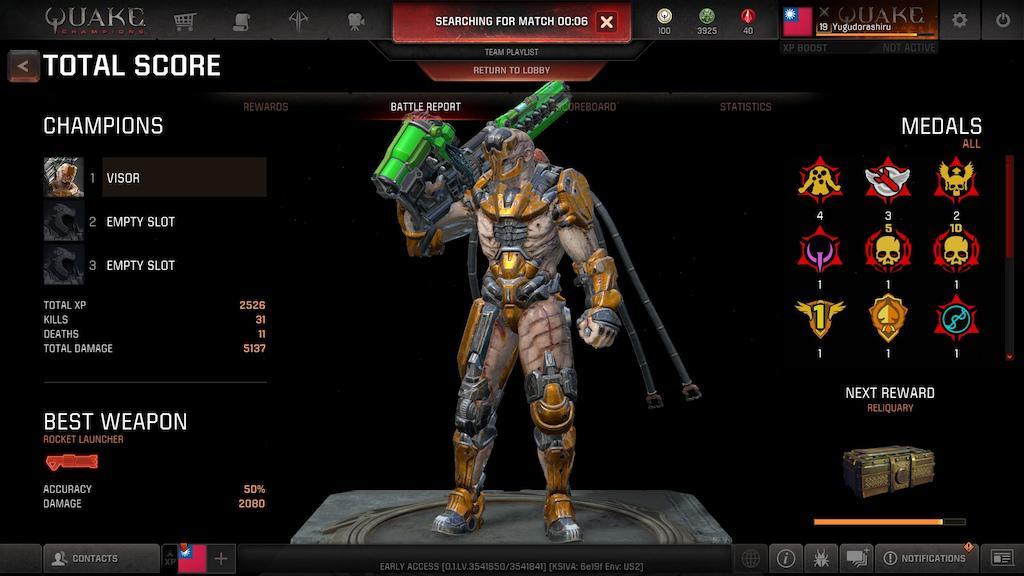
I think the game itself is ok. All you had in QIII work just fine. But whole interface around it are made by someone blind.
 Mission text name of gun you need to shoot with, but you see only icons while match. Rune menu are in customization section, but when you get one it doesnt lights up as new equipment and you can't see where it goes. Also you have to uncheck new colours on EVERY hero or notification will glow forever. Its was an issue at Overwatch but even back there it didn't take so much time to load character models (in Quake even color pallets load so slow).
And such problems are everywhere: hero switch button very small, player from your group didn't color different from your team, time counts with stopwatch and not timer etc.
This simple things are standard in modern games and I see no reason to did not have it here.

And such problems are everywhere: hero switch button very small, player from your group didn't color different from your team, time counts with stopwatch and not timer etc.
This simple things are standard in modern games and I see no reason to did not have it here.
1